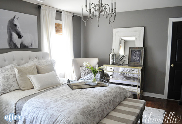
Michelle from Prudently Painted Vintage proves to her pre-teen that you don’t need to be able to see the paint color with your eyes closed to have a cute room.


Michelle from Prudently Painted Vintage proves to her pre-teen that you don’t need to be able to see the paint color with your eyes closed to have a cute room.

12 Comments
mapleandmagnolia.com
January 21, 2011 at 12:34 AMI LOVE the artwork over the bed…beautiful!
Meg and Mum's
January 21, 2011 at 12:37 AMAaahh much better! This room looks lovely and I really like the wall art!
Anne-Marie @ 10 Rooms
January 21, 2011 at 1:35 AM“see it with yours eyes shut” – ha! That is such a great way to describe the barking mad hue in the first pic – really pretty after..
FOUR ALL SEASONS
January 21, 2011 at 2:13 AMI love the after!!! I also like the black and white with the soft pink! I bet she likes it also!
Prudently Painted Vintage
January 21, 2011 at 4:55 AMThank you for featuring my daughter’s room redo! Thank you for all the nice comments as well.
boopnut
January 21, 2011 at 12:33 PMSo much better, and I love the zebra print on the bed!
Kim@Chattafabulous
January 21, 2011 at 1:24 PMFunny how kids always select the most vibrant paint color in the fan deck! My daughter has the same bedding in her room – so cute!
Sandy aka Doris the Great
January 21, 2011 at 1:25 PMSo much prettier now (and you don’t need to wear your sunglasses while making the bed.) But isn’t that first pink the new “IT” color for this season?
Vicky
January 21, 2011 at 1:32 PMMy 5 year old is the same – the brighter the better. Love the zebra. I just bought the same material for my chair.
Irene Robertson
January 21, 2011 at 7:09 PMWhat a cute room. Girly, but not too much.
Wendy
January 24, 2011 at 8:39 PMLMAO!
WOW, much better after!
Diane | Dwelement.com
January 24, 2011 at 3:40 PMPerfect example of how a subtle wall color can still result in a vibrant room. The brightest colors need not be on the *walls.* Great choice!