
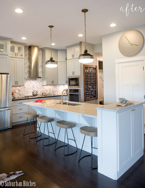
Cliché alert! Less is more. Debb’s kitchen here shows us how. Gone is the ill-fitting microwave above the stove, leaving just a wide open breathing space. Gone is the seating area around the narrow storage-space eating peninsula. Instead Debb decided to widen it and put the back side to work. No more wasted space in this place!
I’m also loving the black and white cabinets and the darker band in the crown moulding. Cool! Thanks for sharing Debb!


9 Comments
Mel
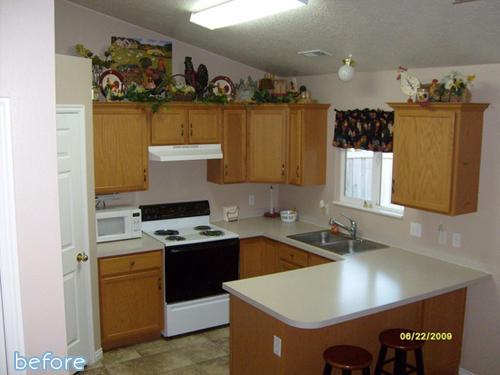
January 14, 2011 at 11:15 PMI had to keep going back and forth between the before and after photos to realize that it really is the same kitchen!
Fantastic.
LaKeta
January 15, 2011 at 12:27 AMI love the black on bottom white on top cabinets!!! I have been wanting to redo mine like this but hadn’t seen pics of it…I’m such a visual person! LOVE IT!
LaKeta
W Family
January 15, 2011 at 12:37 AMBeautiful and warm! Debb (if you’re on here), what color/style is countertop? I’ve been looking for a granite color that would work well with my black appliances and this looks like it may be it. Thanks! Great job!
Katy
January 15, 2011 at 12:58 AMThat’s totally gorgeous but where do they microwave stuff?? I’m concerned (cuz that’s the only cooking appliance I use!)
loooove that tile !
Katie
January 15, 2011 at 2:27 AMGorgeous! Love the dark band in the moulding!
leslieahardy
January 15, 2011 at 2:34 AMThe granite looks like St. Cecilia. I just got new granite and was deciding between that and Butterfly cream.
**Mumzy
January 15, 2011 at 2:39 AMLOVE THIS!!
Mrs. DeVore
January 15, 2011 at 2:23 PMWhat an awesome kitchen!!!
Jenny
January 15, 2011 at 9:02 PMThat looks so good! I’ve been thinking about doing the same thing with our “bar” where we never sit! 🙂