
If you’ve ever filled a room with furniture and then looked around and thought … “That just ain’t right,” I’m here to help! The problem, my darling, may be scale.
I’ve seen it a million times. Over-sized furniture crammed into an under-sized room, or tiny apartment-sized furniture trying its darnedest to fill up a spacious room. Neither one will ever scratch that itch of looking quite ‘right.’
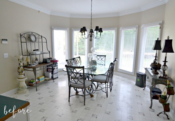
This breakfast nook is a classic example. It was full of furniture, but just seemed off. Nothing really takes advantage of the fabulous high ceiling, which leaves the room feeling very flat. The baker’s rack is struggling to fill up the wall on the left, and the wall on the right seems thrown off-balance by the oversized lamps. Plus, everything in here is made from metal and/or glass, which also makes it feel a bit cold. Flat and cold. That’s how I like my pillow at night. Not my breakfast nooks.
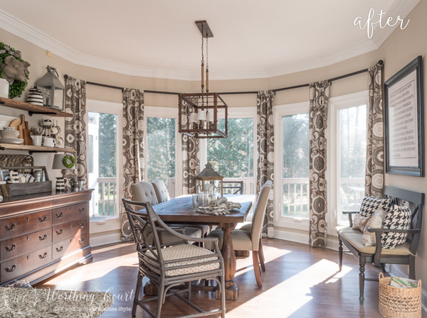
But then Suzy from Worthing Court moved in, and brought with her plenty of warmth (and well-scaled furniture)! She framed the wall of windows with curtains and hung them nearly a foot above the casing, which elongates the whole room. Open shelving on the left also extends up, up, up the wall and is filled with a nice mix of accessories, large and small, which adds even more depth and interest. Such a great job! I am giving Suzy a mental high-five right now!

8 Comments
Vanessa D.
May 24, 2016 at 7:19 AMShe did an amazing job on this transformation! I love the curtains and the light fixture.
Rachel H
May 24, 2016 at 7:37 AMOh man – SO much better!! Best changes are the floor, light, and curtains!!
Jake's a Girl
May 24, 2016 at 11:25 AMThat is one lovely makeover!
Erin Belmore
May 24, 2016 at 7:11 PMWhat a transformation! From a plain one to an awesome one. Though I love white and the first image seems good to me already, I still choose the second image because it has a lot of texture that I really love also. Thanks for sharing this one. I have an idea now already.
Kendall Dickerman
May 25, 2016 at 5:22 AMabsolutely gorgeous!!!
Janet A
May 25, 2016 at 11:07 AMWhat a difference! I think the biggest problem with the before is that everything is leggy. If the two furniture pieces along the walls were solid, like a dresser or buffet, it would have been better. I like to combine leggy things with solid things so a room looks neither too heavy nor temporary…like it’s all just going to walk away.
Lindsey @ Better After
May 25, 2016 at 12:41 PMYes, leggy! I totally get it. It makes it look sparse somehow.
Karen
June 7, 2016 at 7:43 PMOh wow! That is stunning! I don’t often “ooooohhh!” over the after shot but I did on this one.