
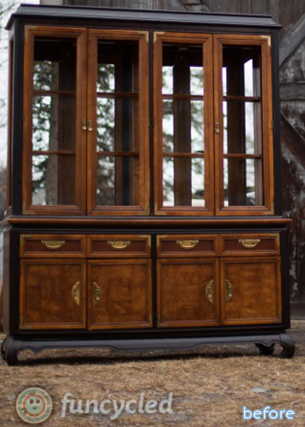
If you’re one of those people that can’t stand to see furniture painted, you should probably step away right now. Go have a bowl of cereal. Take a short walk. Do a cross-word puzzle. Because (spoiler alert) that’s what is about to happen to this hutch. So don’t say I didn’t warn you!
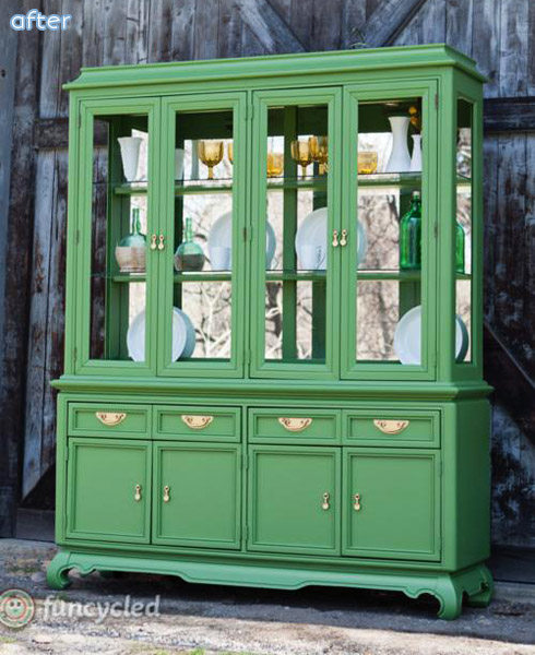
If you are one of those people who thinks that painting perfectly good furniture is A-OK, then read on! Furniture’s purpose is to work for us, not the other way around, that’s what I think. And this hutch’s overly fancy finish wasn’t working for Sarah. She pictured more of a Hollywood Regency style: a bright color that would show off its Asian flair and glamorous mirrored backside. Mission accomplished!
Sneaky fact: she took out the glass in the doors to make for better pictures! Genius. Check it out at Funcycled.


16 Comments
Mary
June 10, 2014 at 3:28 PMGORGEOUS!
Shaleeta
June 10, 2014 at 3:42 PMI think that was the perfect color choice 🙂 I always struggle with painting furniture, but I love it in the end.
Paula Lusk
June 10, 2014 at 3:58 PMOh that looks GORGEOUS! It looks so much better green. What a statement piece.
Marci
June 10, 2014 at 4:26 PMYou’re right. I should have stepped away. 😉
laura@top this top that
June 10, 2014 at 4:43 PMbeautiful. it should make non believers into believers!
Gretchen
June 10, 2014 at 5:33 PMWhile I love me some painted furniture, I should have stepped away on this one. I adore the colour, but not on that piece. I believe it’s a Century hutch.
Peggy
June 10, 2014 at 5:36 PMAhhh. You’re right! That IS more like it! Beautiful job, Sarah! The piece looks so much lighter and happier!
LeeAnn
June 10, 2014 at 6:12 PMThat color is gorgeous and now the hutch is too.
Autumn
June 11, 2014 at 8:05 AMDoes anyone else feel the brass accents on the doors should have stayed? I think the piece needs them! Otherwise, I don’t mind the paint job — it needs it. Where could you put this big hunk of dark? Unless you live in a huge manor house – it would just suck the light out of a regular-sized room.
Lindsey @ Better After
June 11, 2014 at 11:03 AMI agree exactly!
Jessica H
June 11, 2014 at 8:22 AMI am torn on this one, but I’m leaning towards really liking the after version. The before version is certainly dark and has a heavy, dour look to it. The after version is much brighter and eye-catching. I think my main problem with painting furniture is when the paint covers up some inherent beauty in the wood or covers up a valuable antique. While the before version is nice, it is not wow. Now it is more wow.
Carol-Anne
June 11, 2014 at 11:09 AMLove it! I will never understand people who think that wood turns into plastic when you paint it!
Julie
June 11, 2014 at 11:33 AMoh, i love this! the green really makes the hardware pop, doesn’t it?!
Sarah
June 11, 2014 at 1:17 PMThanks so much for sharing our piece and all the sweet comments guys!! You all just made my day!! 😉
abbie
June 12, 2014 at 5:14 AMI love the makeover (not a color for my own house, but I can certainly respect an awesome paint job), but I’m with Autumn–I miss those little decorative brass L’s at the door corners. It looks great now, but I think those would “oomph” it even more!
Terresa
June 15, 2014 at 6:19 PMOkay, I have to say that when I saw the before I cringed at what the painted after might be. But I LOVE it. So, so awesome. I would love to have that in my home. It is a statement piece, it is eyecatching, it is magnificent. Way to go on this re-do!!!