
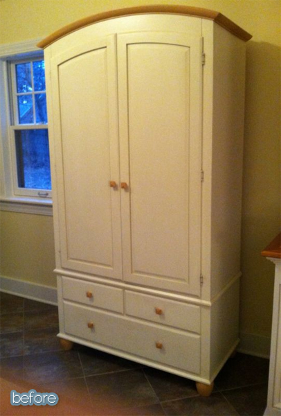
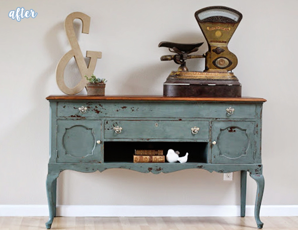
Something about this armoire seemed sad. Probably because the top of it was shaped like a frown. And that color was so lifeless too. Doesn’t it look like it needs a hug? Man, I’m getting bummed out the more I look at it. But, hold on to your flip-flops, because you won’t believe what Sarah at Funcycled did with it. AMAZIFIED it. Seriously. Amazing.
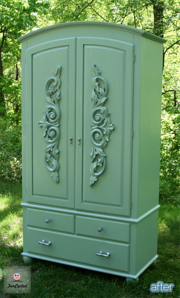
Sarah reports that those hand-carved onlays did not come cheap, but they added so much to this piece that whatever she paid was worth it. It’s positively heirloom-worthy!
PS: I’ve gotten some comments from a few readers lately saying that they’d really like to see the before and after pics side-by-side on this ol’ blog too. So let’s try it out, shall we?
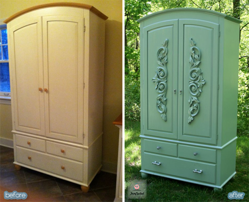
Boom!
What do you think? I can see the appeal, but it’s also like … 20 seconds of extra work for me, so I don’t knowwwwww … I’d love to hear your thoughts.

40 Comments
purelygenuine
June 28, 2013 at 4:14 PMI like the individual pictures better. I like being surprised when I have to scroll down.
Alison
Andy and Nicole Kidd
June 28, 2013 at 2:32 PMYes! Side-by-side is great. Less scrolling (and an extra 2 seconds) for us 🙂
Korkowski Kit & Kin
June 28, 2013 at 2:33 PMLove the side-by-side shots!
Wendy
June 28, 2013 at 2:36 PMI like them better as single shots – ONLY because they are larger, and you can see more details. 🙂
Andrea Archambault
June 28, 2013 at 2:40 PMI vote vertical images should go side by side, but keep horizontal ones separate.
Jessica @ My World - Made By Hand
June 28, 2013 at 2:49 PMI do love the side by side shots.
Martha
June 28, 2013 at 2:50 PMI don’t see the need for extra work on your part. I agree with Wendy; and it’s no big deal to spend the time observing the differences from an independent perspective. It increases my ability to drink in the changes. You’re helping my cognitive abilities, Lindsey! Thank you!
Martha
June 28, 2013 at 2:54 PMI like the new color on the wardrobe. I think that the carved accent is too much; it’s a simple design and it clutters up the charm of the piece. I DO, however, like the change in pulls on the drawers and the change-out of the door pulls to keyhole pulls. Good job!
Melissa
June 28, 2013 at 2:59 PMI like the side-by-side, but I also like the bigger pictures and the surprise you get by having to scroll down to see the after picture. So today’s format was pretty much perfect–the big pictures for the big reveal, but smaller side-by-side so you can compare the difference easily.
PML
June 28, 2013 at 3:14 PMside-by-side = great idea
Ariela Haro von Mogel
June 28, 2013 at 3:20 PMI’m on the side-by-side boat (that sounded weird)! 😉
LOVE the after with the armoire. GORGEOUS!!
Ariela Haro von Mogel
June 28, 2013 at 3:22 PMI also agree with Melissa. I like having the surprise of scrolling down and seeing the after show. I think both methods would serve your blog well Lindsey!
Ashley @ The Houston House
June 28, 2013 at 3:26 PMLooks great!
Hil
June 28, 2013 at 3:49 PMNot to make even more work for you, but I also like Melissa’s idea to have the big pictures followed by the side-by-side, like you did this post 🙂
Katie
June 28, 2013 at 3:59 PMI like the side by side, but I like the vertical as well – I get bigger pics if they are vertical so can see details better. Do whatever is easiest for you. I’ll keep coming back no matter what.
Rebekah
June 28, 2013 at 4:10 PMI’m with Melissa: Love the surprise factor of scrolling down and your commentary in between but I LOVE the side-by-side mostly so it can be pinned as one image! I think being able to do that would draw more attention to your blog, actually!
judy r
June 28, 2013 at 4:11 PMAt Last! I’ve wished for side-by-side pics – for me, it’s easier to make the comparison. Whichever way you decide to go, thanks for what you do.
Katie
June 28, 2013 at 4:33 PMIndividual furniture pieces could go side by side, but whole room makeovers need the extra space. Plus, side by side ruins the big reveal factor which is fun. I like reading your commentary before I see the piece in question. Also, since I read your blog in Feedly, there are sidebars that reduce the actual space allotted to the blog itself. So the pictures are smaller for me than they would be for you.
Cindy * Daisies and Crazies
June 28, 2013 at 4:33 PMOkay, first of all, what would I do without you to crack me up every day? Love the makeover. LOVE the side-by-sides. The 20 seconds is totally worth it. haha
Cindy * Daisies and Crazies
June 28, 2013 at 4:35 PMOh, I just read the other comments… I like it just the way you have it today:
BEFORE
AFTER
Side-by-side
🙂
Bella♥Storia
June 28, 2013 at 4:46 PMLove how you did this post: a single large pic of each and then a side by side of the before and after at the end. Perfect!!
Sarah Trop
June 28, 2013 at 7:40 PMThanks so much for sharing the piece, Lindsey! Your posts always make my day!
-Sarah from FunCycled
http://www.funcycled.com
Christy Wiley
June 28, 2013 at 8:19 PMOh my!!That is so beautiful, it took my breath away! Seriously…I stopped breathing.
I need to find an armoire now!!! Amazing job!!!!!!
Dana Beam
June 28, 2013 at 10:06 PMLove the side-by-side pictures!
Maria
June 29, 2013 at 12:04 AMI love to see them as a scroll down, bit like the ol’ drum roll and then TA-DA!!!! But then if I want to actually compare something I prefer side by side.
However who cares in this case? This armoire is divine! Wonderful job!
Connie@Connie Nikiforoff Designs
June 29, 2013 at 1:17 AMLOVE the ‘after’ especially since it isn’t distressed 🙂 I always wonder why some pieces get all that prepping done only to make them look worn out already (?) Just my own opinion…. And yes the side-by-side photos are a great idea. 🙂
Sarah N
June 29, 2013 at 2:39 AMYes for side by side – picmonkey makes it oh so easy!
Marci
June 29, 2013 at 4:11 AMThe side-by-side is better to compare the befores and afters, but we still need the before at the top with the after underneath for the dramatic reveal.
Lisa Noll
June 29, 2013 at 8:17 AMBoth separate AND side-by-side. Today’s post is perfect, big pics and surprise at the top, with a smaller side-by-side image at the bottom. The smaller side-by-side pic is perfect for pinning!
Janet
June 29, 2013 at 2:09 PMI love scrolling down for the reveal!
Pink Overalls @DIY Home Staging
June 29, 2013 at 11:49 PMAnother vote for side-by-side.
sweetouch!
June 30, 2013 at 8:31 AMThis is the perfect re-do. I love it. Nice job
LeeAnn
June 30, 2013 at 7:15 PMThat is the cat’s meow!! Love the color & the inlays.
LeeAnn
June 30, 2013 at 7:16 PMThat is the cat’s meow!! Love the color & the inlays.
LeeAnn
June 30, 2013 at 7:17 PMOnlay, not inlay. That’s what I really meant. 😉
Sherron
June 30, 2013 at 7:17 PMI like being able to see both images at the same time, so I am a fan of the side-by-side picture at the end of the post. I really like having the larger single pictures to see first.
Codi Ethier
June 30, 2013 at 11:08 PMI’m going to pretend that my email was what made you go side-by-side 😉 I love the larger detail shots of the separate, but I LOVE the before and after contained in one picture file for inspiration-folder/pinterest goodness!
cjm
July 1, 2013 at 6:37 PMI also like how you did it in this post.
Cassie
July 11, 2013 at 12:47 AMI do like the format you used in this post as well.
Morgan
September 17, 2013 at 11:34 AMKeep the side-by-side pictures!!! It’s amazing!!